The Halfday Label Redesign project was to redesign the drink labels for a chosen drink company. I chose Halfday. My over aim was to create a redesign that highlights the healthiness of the drink while also providing a more classic, cohesive look to the overall design.
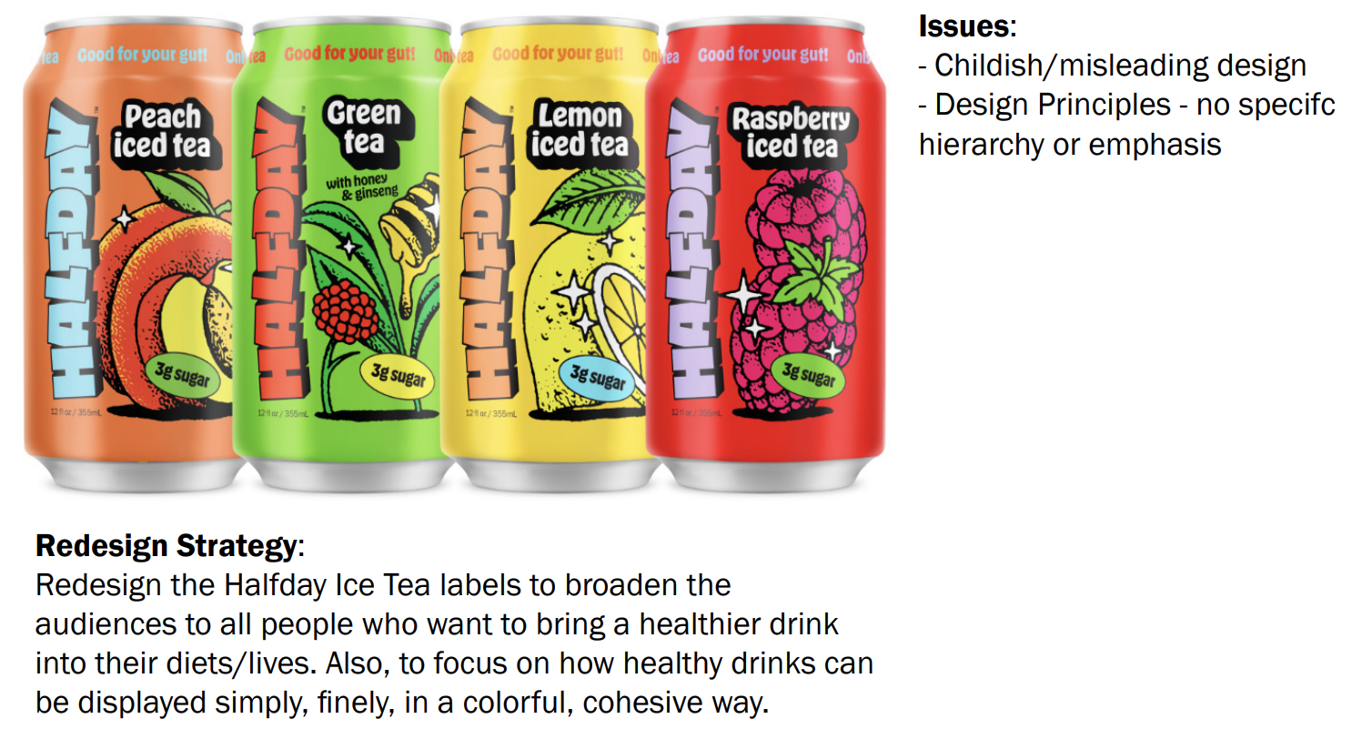
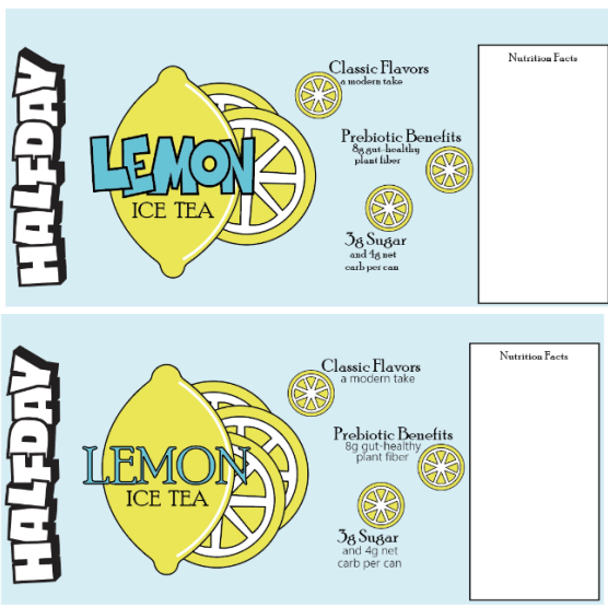
This is the original Brand Design.
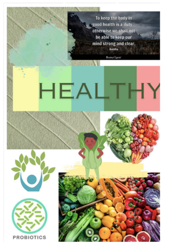
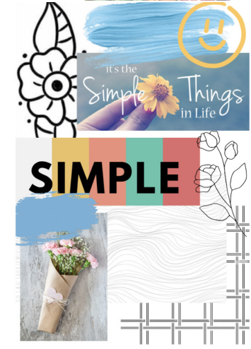
These are my Mood Board Inspiration and the Label Ideation Sketches.

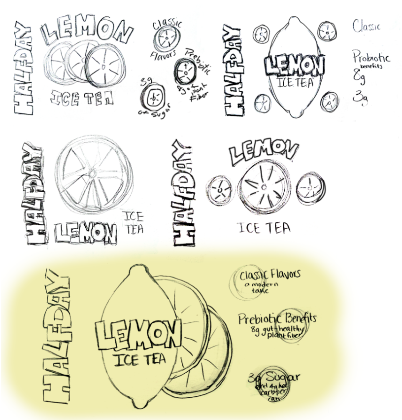
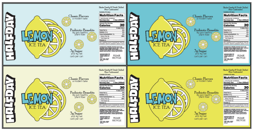
I went through design, color, and font variations, and laid out all the options so I would make the choice I felt matched the overall theme I wanted to go for.

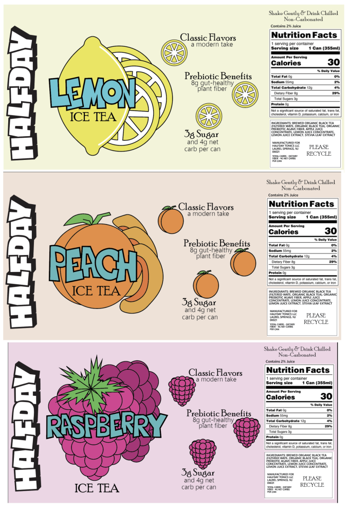
These are my Final Label Designs with Three Flavor Choices, and Adobe Dimension Model. All three flavors follow the same design hierarchy and classic, healthy feel.
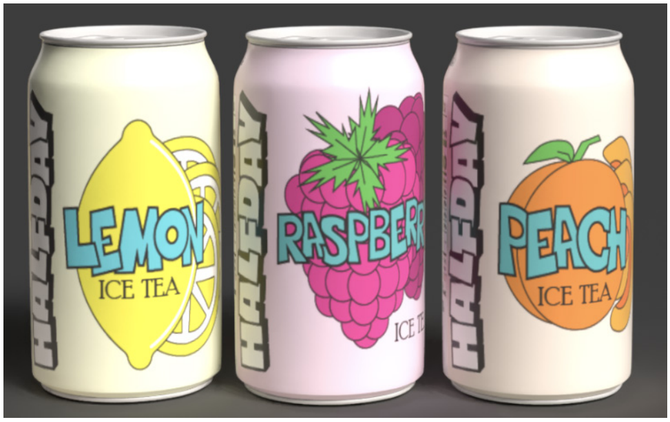
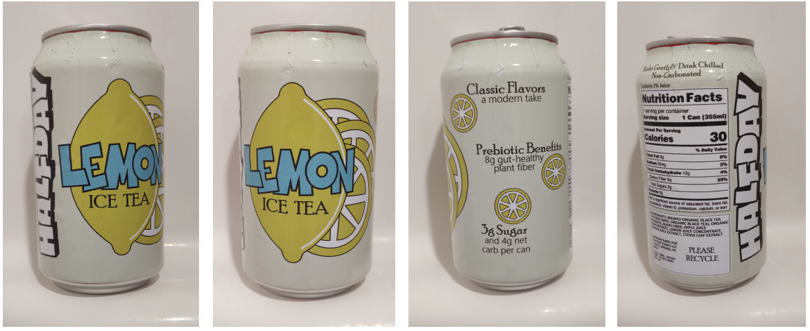
This is my Final 3D Model. I printed the main flavor label onto a sticker and wrapped around one of the original Halfday cans to get a better feel for the overall layout and feel of the label.